
Grantmaker
Philanthropic foundations are led by people from diverse backgrounds - each uses very different methods to evaluate how to distribute wealth. Because foundations don’t compete for business, they have historically had little reason to develop industry-standard practices or standards.
Grantmaker is a Saas CRM sold to foundations with of the philanthropic giving process. It serves clients ranging from family foundations operating on pen and paper to some of the most sophisticated leaders in the world, like the Ford Foundation, Bloomberg Philanthropies, and the government of New Zealand. In order to seal Fluxx’s largest-ever contract (>30M ACV), Fluxx agreed to step back and make improvements to the core experience.
Design gets a seat at the table
I worked with the Lead PM to define specs and wrote the all of the CSS, while contributing significantly to the jQuery-based frontend of Fluxx’s web-based product. Additionally, I was responsible for delivery and change management, guiding the efforts of our QA Team and Software Engineers as they crunched through the 97 linked JIRA tickets that arose during pre-release testing.
To cap it all off, I delivered our product keynote for the Dashboard Manager at FluxxCon, our 3-day client and partner conference.

Raise your hand if you like accessible interfaces!
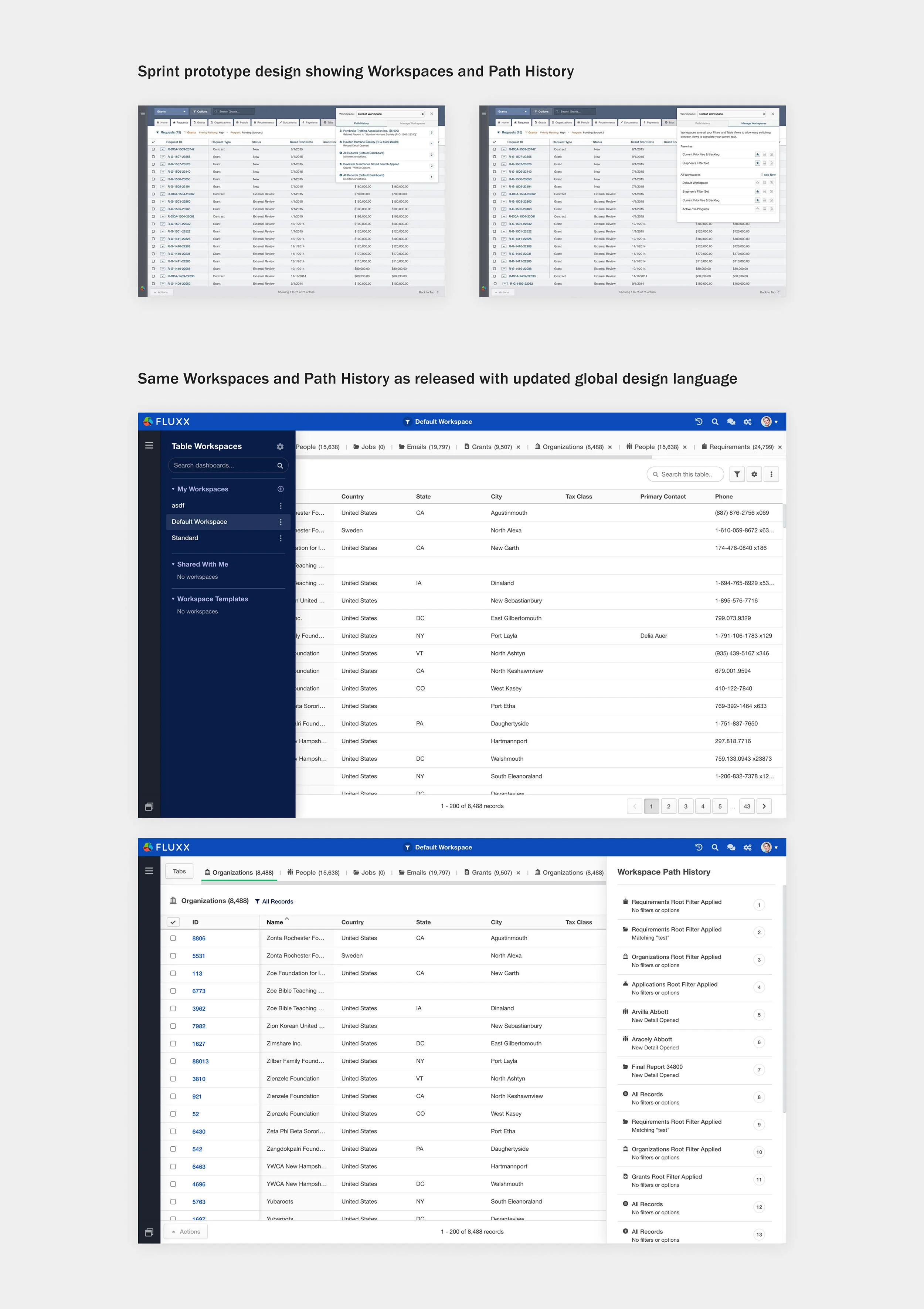
Data-based prototypes crucial to closing
Over three design sprints, I worked closely with a lead engineer, Fluxx’s CEO and the VP of Product to convey a vision based on their past discussions with the prospect. The engineer managed an incredible feat of dumping out real data and link it up to a very rough prototype of our navigation in jQuery, and I came up with loose designs to solve various user stories, and wrote Javascript, HTML/CSS to render them.
It was exhausting, but jitter-inducing. The deal was made, and while the sprints ended, the real work had just begun. Over the course of the next year, design solutions continued to evolve - both because I built a better understanding of the problems we were solving in that sprint, and also because of improvements I made to Fluxx’s nonprofit product, Grantseeker, that I systematized and incorporated into Grantmaker.
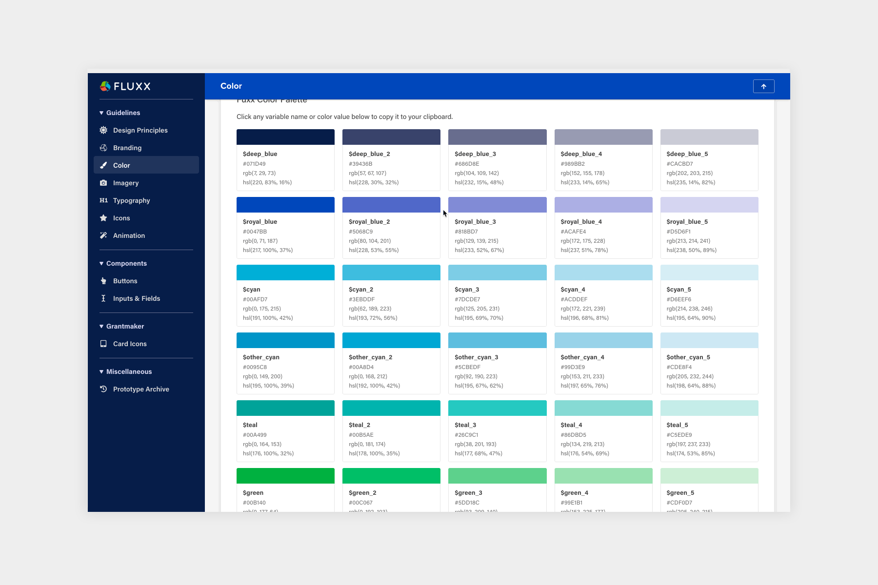
More about Grantmaker
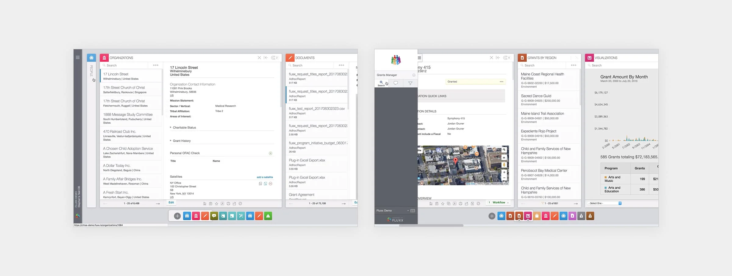
In Grantmaker, Dashboards are comprised of an unlimited number of Cards. Cards are sets of one type of data (eg: Grants Card, Payments Card, or Requests Card). You can think of Cards as folders and Dashboards as an entire desk tailored to one workflow, allowing grantmakers to seamlessly switch back and forth between any of their individualized desks as desired.

We set out to expand how grantmakers could reorganize their Dashboards, leading to what was eventually called the Dashboard Manager. The previous side menu contained everything a user might do besides interact with their Cards. Although this kept the main Stage (working area) free of distractions, I discovered three main client frustrations:
People were afraid to click on things because they weren’t sure what would happen.
It was too easy to get lost in the menus and become confused about how to edit Dashboard metadata or create Dashboard Templates.
Grantmakers were annoyed they had to open the Drawer to access unrelated pieces of functionality (such as Universal Search) that lived in the Drawer, and then close it afterwards.
In order to reframe some of the more than 100 line-item requirements into enhancements for the entire ecosystem, I worked in lockstep with the PM Director, Gavin. He kept our customer in check and navigated nuance around contract language, while I synthesized the needs of other groups including small foundations and our enterprise customer advisory board and did broad narrative exploration.
With input from grantmakers, consultants, and internal Services teams, we were then able to identify that the management and organization of dashboards presented an opportunity to redefine the market in our space with a class-leading experience.
Using design mockups to refine contractual scope
While rapidly exploring wide concepts, I prepped some mocks to match contracted requirements literally (eg: “I must be able to see and operate each distinct type of Dashboard separately”), and shared discussion points on trade-offs that came with a particular approach.
Amazingly, we were able to completely eliminate some contract requirements and get others re-written into versions that were more valuable to the rest of our clients.
I was able to continuously run in-person and virtual research sessions with customer slices representing each segment (quantity of employees) and implementation partners. Their involvement allowed me to quickly make UI decisions and identify which functional areas, such as sharing or organization, resonated most with customers.
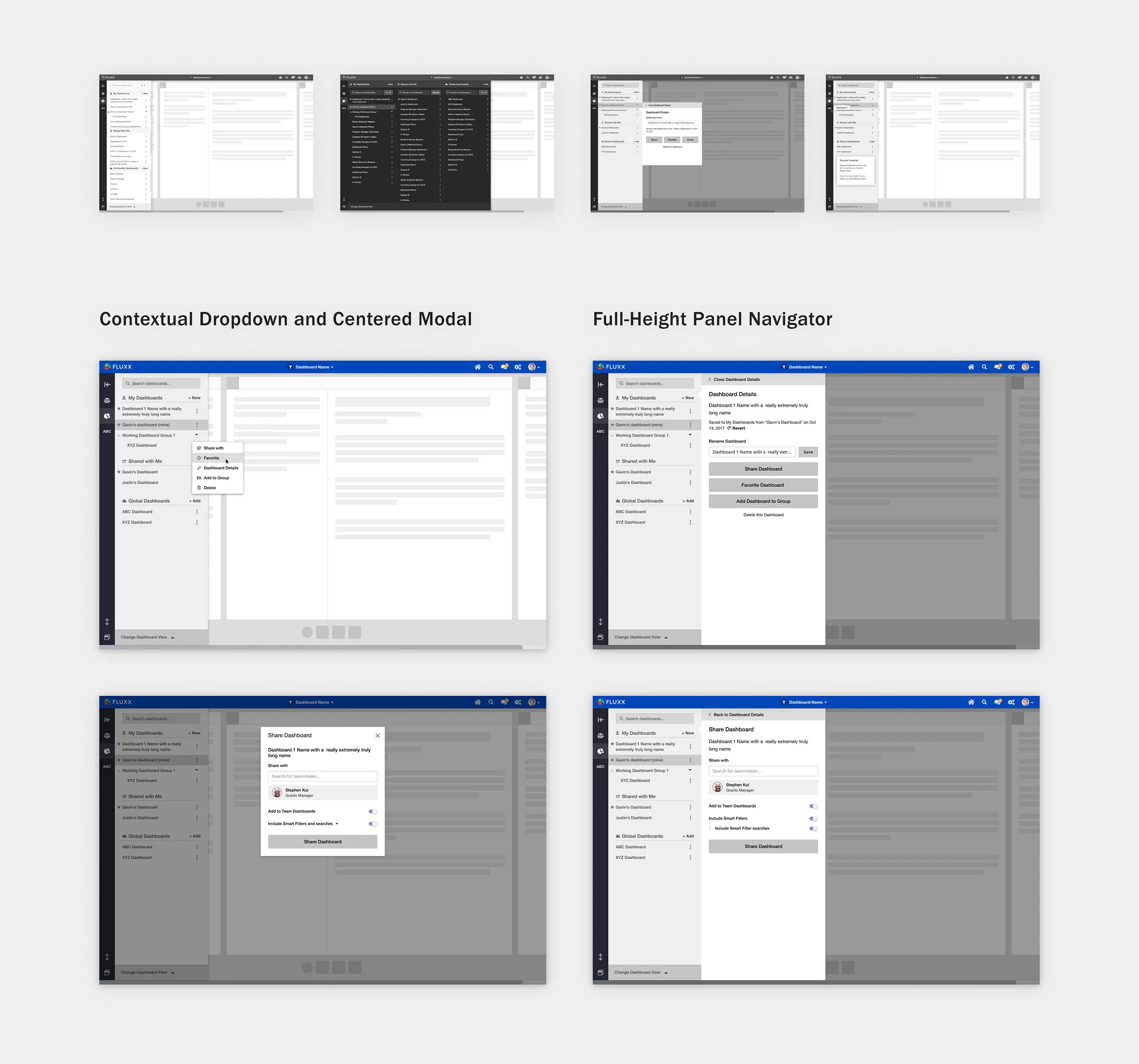
Some test participants were really excited about having a simplified set of actions that the contextual dropdown and modal brought, while others liked having one place to do everything with a Dashboard. At this point, Fluxx’s early switch to Figma 😍 allowed me to rapidly test different approaches to the same functionality through its prototyping prowess.

Proof I cannot draw straight lines without a dot matrix

Nobody likes sweeping redesigns
Especially not foundation clients who celebrate the fact that some of their vendor systems haven’t changed at all in the last quarter century as a benefit.
To alleviate this disruptive change to a core job to be done, I broke the Dashboard Manager plans into distinct milestones that could be parallelized and rolled out independently. I then frontloaded my work on the Fluxx Design System components so UI and visual design-only changes would be in our grantmakers’ hands long before the major interaction updates.

Core Design System components in Figma
Tools to enable engineers to work more efficiently

All the tangential changes pulled out separately to isolate the visual UI from the new dashboard management functionality
I kept a close eye on feedback through our Customer Success Managers while we migrated to FontAwesome icons, enforced consistent buttons/tabs/lists, and moved functionality outside the scope of a Dashboard to the header.
A surprising win was that this eased the transition for grantmakers from our “Legacy” view (previously called Themes in the product) to our primary view. Fluxx had been suffering from maintaining two separate codebases two view the same data, and the gradual rollout combined with the benefits of the Dashboard Manager enabled Fluxx to commence its retirement of the “Legacy” view more than two quarters ahead of schedule.

A gradual evolution reduced the burden on engineers, QA, and clients
The Dashboard Details Pop-Up
Anything and everything that can be done with a Dashboard is done from the Dashboard Details pop-up, and each action a top level item from there. Grantmakers were overwhelmingly in favor of simplification, and allowing them to focus on one task in isolation was paramount to fulfilling that desire.
A user can do whatever they want with anything in their My Dashboards section and any Dashboard Template they are the owner of. Dashboards in the Shared With Me section, and any Dashboard Templates they do not own must be cloned to their own copy via the Copy to My Dashboards button to make changes.
Shortcuts vs Favorites
Originally, we thought a user could save their favorite Dashboards in the sidebar for quick switching, and those should also appear at the top of the list because they were favorited.
However, this decision conflated two separate things and was redundant - do grantmakers want a Favorite at the top of a section when they don’t need to open the Dashboard manager to access them in the first place?
Study participants understood the concept, but it didn’t feel natural to them. Ultimately, many chose to save Dashboard Shortcuts for their permanently relevant Dashboards, and Favorites to surface short-term items they use heavily but temporarily.
Dashboard Groups
Groups were originally sorted alphabetically within their respective lists. IF grantmakers used Groups at all, they generally used them as the primary means of organization, so it made more sense to move Groups above all their ungrouped Dashboards.
People often wound up wanting to have one Dashboard exist in multiple groups, as I learned some people had workflows to create and deprecate Dashboards. To handle this, Groups work more like tags, using the same modal that could be used for adding or removing no matter where it was opened from.
The yellow notice at the top of each modal upholds the Fluxx Design principle of Teach in Context to alleviate a common theme that customers mentioned: the fear of clicking anything because they weren’t sure what kind of permanent changes they could affect.
1:1 Dashboard sharing and no more black boxes
The existing collaboration system required recipients to “shop” through a list of Dashboards that had been made available to them, and a chosen Dashboard would appear in their list, but behave differently. This was extremely aggravating to our grantmakers, and they would often create Support tickets just to ask our support teams to explain their own creations to them.
The most excitement-fueling addition was that grantmakers could now take a Dashboard they owned and share locked-down access to another colleague, and any changes the owner made automatically cascaded to the recipient. Owners gained visibility into who was using their Shared Dashboards, and recipients could finally understand what did what in their list.
It’s mine and I can do what I want with it
By introducing the concept of single-user ownership, we solved a common problem with Dashboard Templates. Previously, most instances would have some semblance of Grantee Portal v1, Grantee Portal v2, Grantee Portal v3 and so forth (familiar feeling, eh designers?).
Allowing owners to live-edit Dashboard Templates instead of saving a new one and replacing opened the door for organizations to use Templates as a “live version” of their grantee-facing pages.
The wins are worth the effort
One small detail that had an outsized benefit was identifying Cards that were loading by disabling pointer events and reducing the opacity (visible in the video above), and we gained a huge perceptive performance boost. Clients thanked us for improving the performance of the application, but that release did not modify performance at all.
In the 6 months following its release to all 200+ clients, the quantity of support tickets related to Dashboards was reduced by more than half. The quantity of Dashboards shared with the new system outnumbered those shared with the (still available) “Legacy” system 9 to 1.
Last but not least, our behemoth client successfully migrated their operations to Fluxx, going live on the exact day they were scheduled. This type of transition is unheard of, and the implementation noted the Dashboard Manager completely changed the entire configuration experience for them.