By 2015, Workday had not yet unified its brand standards. Marketing specs required colors from the brand mark while the product Design System used a lighter palette.
Mapping the Workday product suite
Workday has an expansive suite of products, and business development teams at Workday needed to pitch both new and existing clients on the benefits of expanding their product selections.
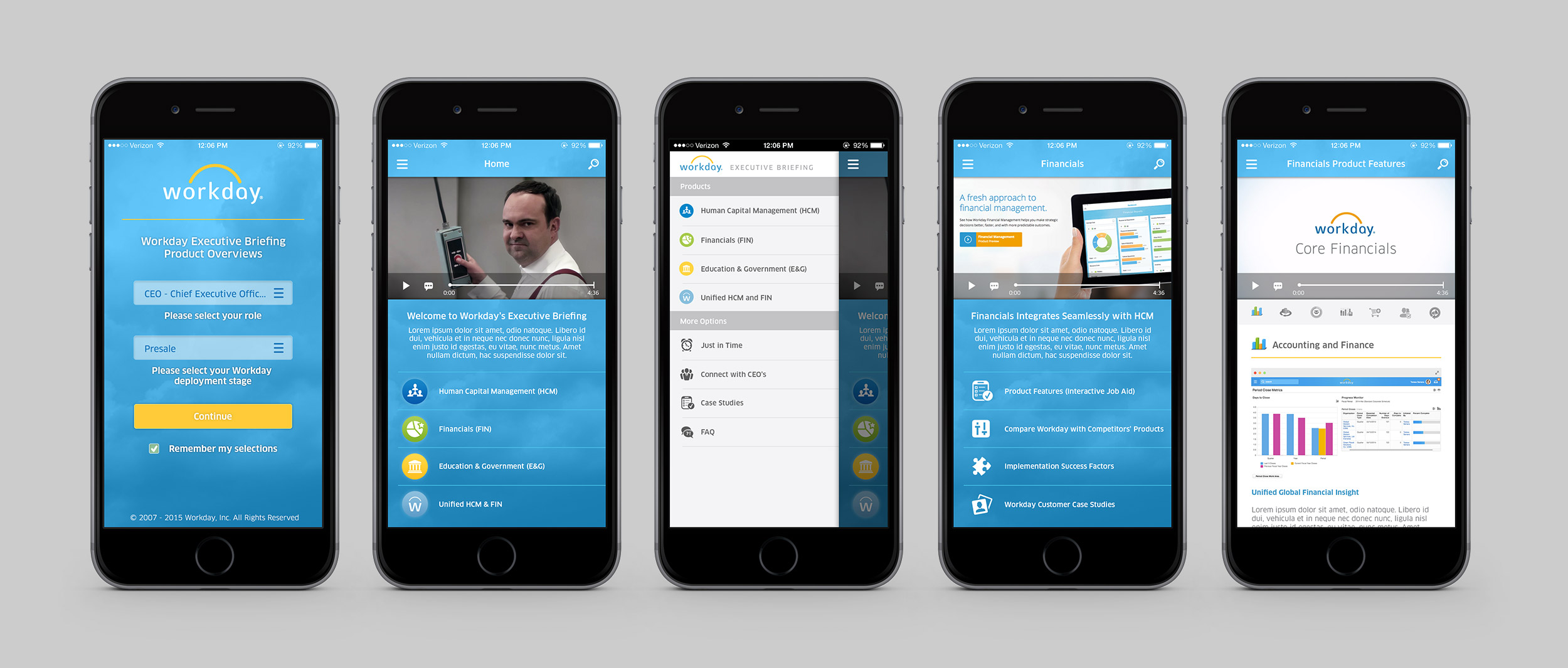
One of my most exciting projects at Workday started with modernizing existing diagrams and adding the informational concept of functional areas to individual SKUs. Eventually, this grew into an opportunity to work with the VP of Education to research and design a mobile app vision concept he later presented to the executive leadership team.
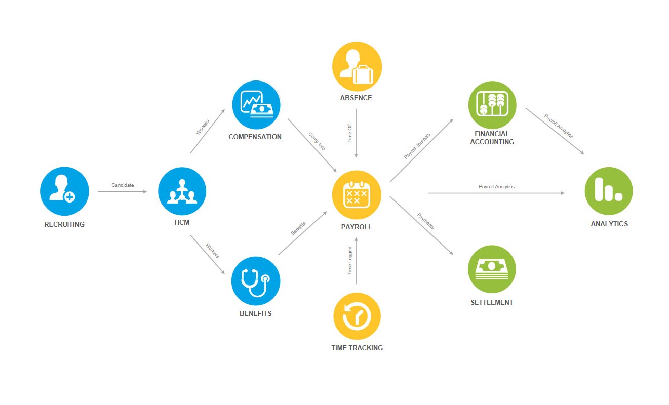
Old Payroll Touchpoints: One of many original diagrams I was given to start from, showing just the base level Touchpoints, but not the functional areas of the product SKUs.
More than just a face-lift for the Touchpoints diagrams
Workday Touchpoints already included a variety of diagrams for an assortment of various core products in Workday, but Workday was strategically organizing the individual product SKUs into areas groups to aid with the sales process. This provided an interesting challenge with a few must-have restrictions:
Each product must fit into a single infographic that could be embedded on webpages
All existing "connections" needed to be kept (and in some cases more added)
Graphics needed to show SKUs (individual bubbles), functional areas (only in the new redesign), and also sales areas (color codes)
Because some areas of Touchpoints were not to be touched, there needed to be a certain degree of parity between the old Touchpoints Kit and the new redesign
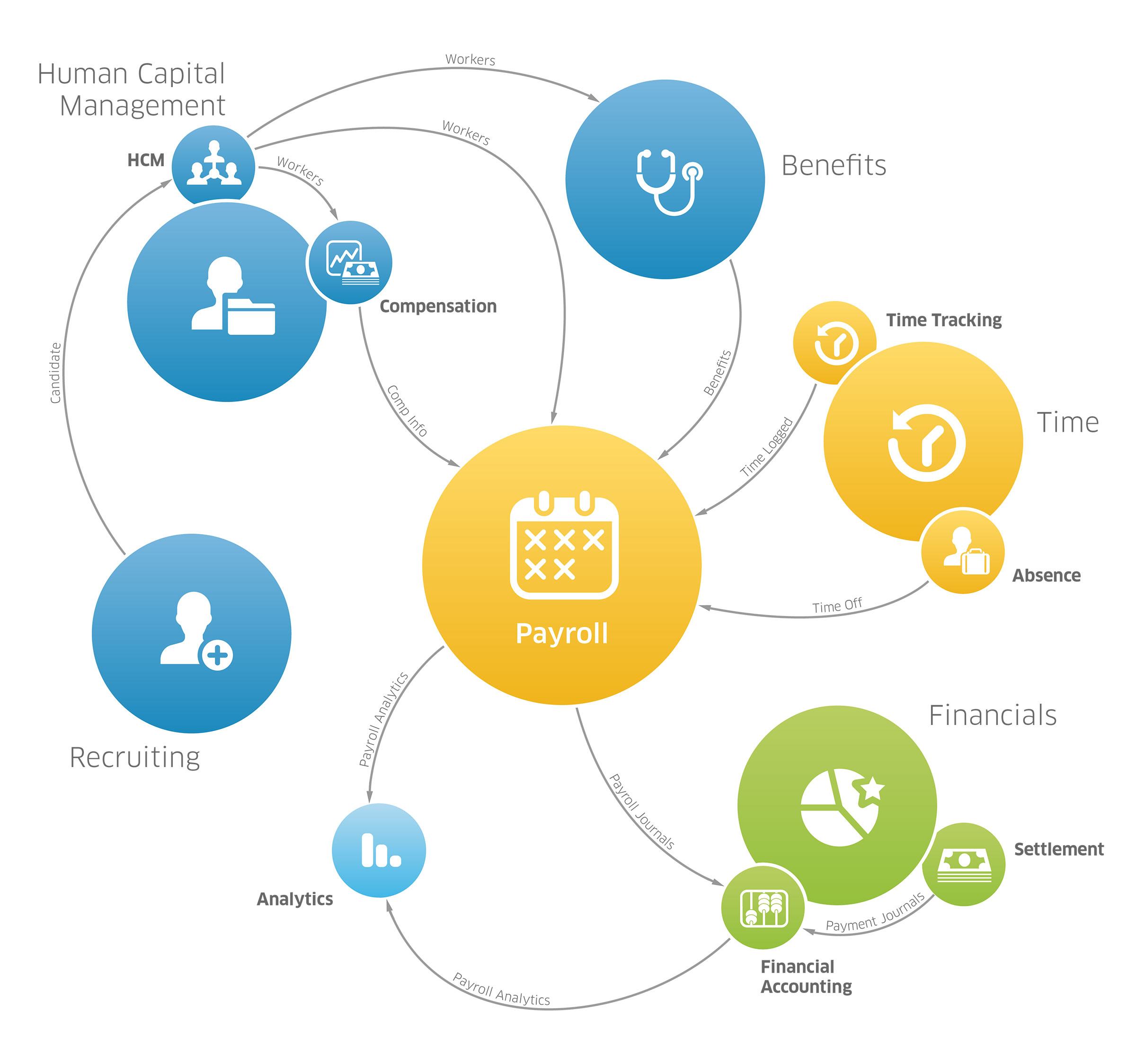
The same diagram shown above, after I redesigned it with the functional areas included
Contour bias and becoming best friends with the pen tool
One of the key differences between the prior Touchpoints Kit diagrams and the redesign is the heavy use of curves in the diagrams. The rigid, straight lines in the original diagrams and the sharp angles created at each point disrupted the flow of the eye going between the various SKUs.
I set out to make the diagrams more approachable digestible, and the principles of continuity and contour bias were crucial to achieving that goal. I added a slight curve to each line to give them a sense of motion, and feel almost contiguous, and grouped functional areas with their respective individual SKUs orbiting them.
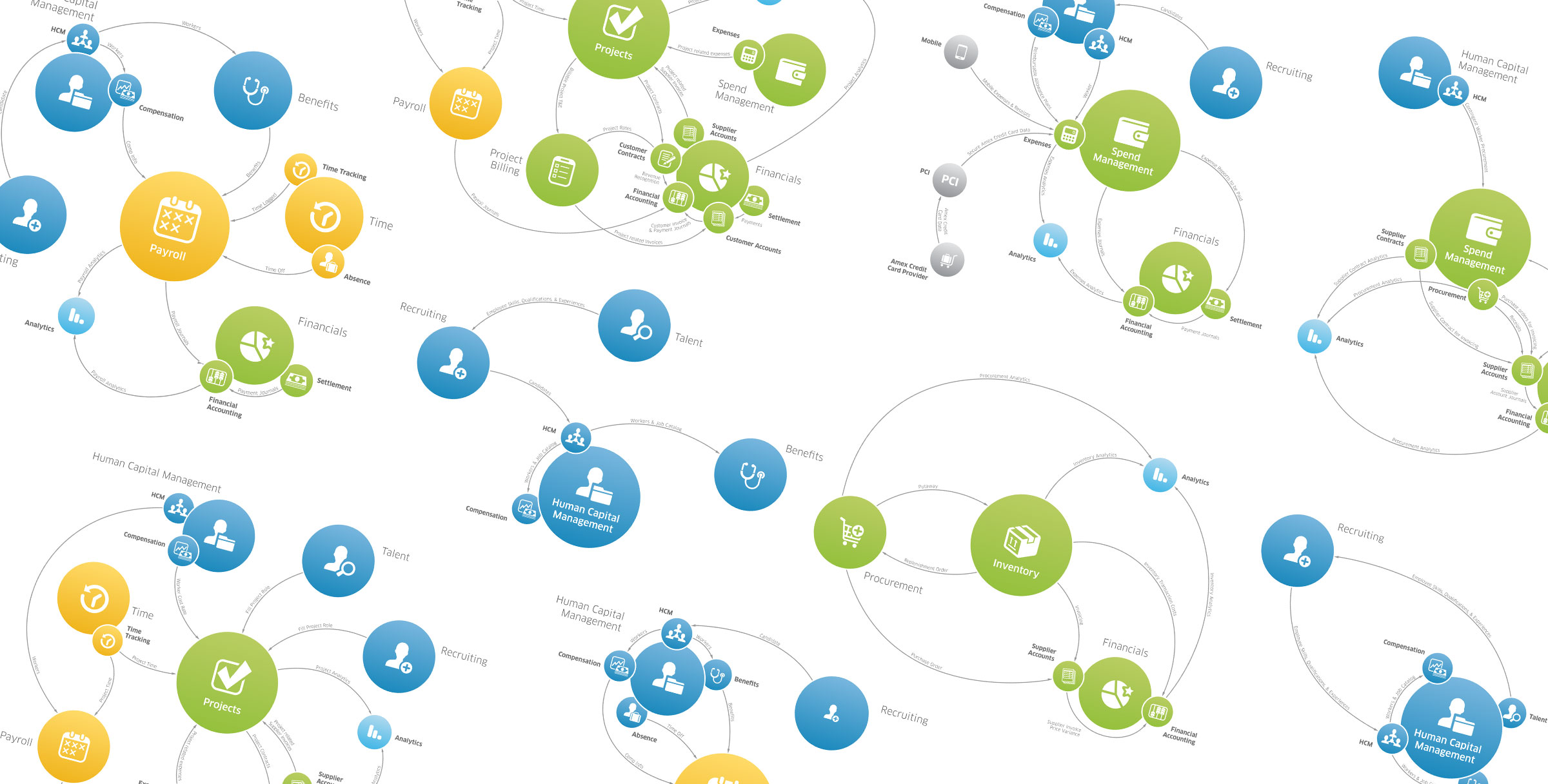
A few of the many Touchpoints infographics, each done by hand in Illustrator.
Imagining an app that blends education and marketing
I visualized examples of how busy executives on the go might learn about Workday’s offerings, and then what trigger points were necessary for those executives to move from thought into action.


These explorations included an interaction allowing users to jump to any product SKU and flow back and forth between different Workday Touchpoints map. The prototype I designed with Pixate was presented at the executive level to articulate the idea, and won approval to take this exploration a level further. Modifications were needed to scale alongside Workday’s ever growing, and ever more integrated feature set.
As a result, leadership elected not to pursue investment in this area as a native solution felt thematically outside the scope of Workday Educations’ charter. However, the loose user journey was well-received internally and paved the way for Workday’s more permanent solution to this need through interactive Adobe Captivate microsites.