Grantseeker
More than 10% of the private sector is employed by nonprofits, and these teams drive some of the most important work on the planet. But the scrutiny on every dollar they spend means they have less to invest in staff and resources, so products in this sector must deliver value tangible value.
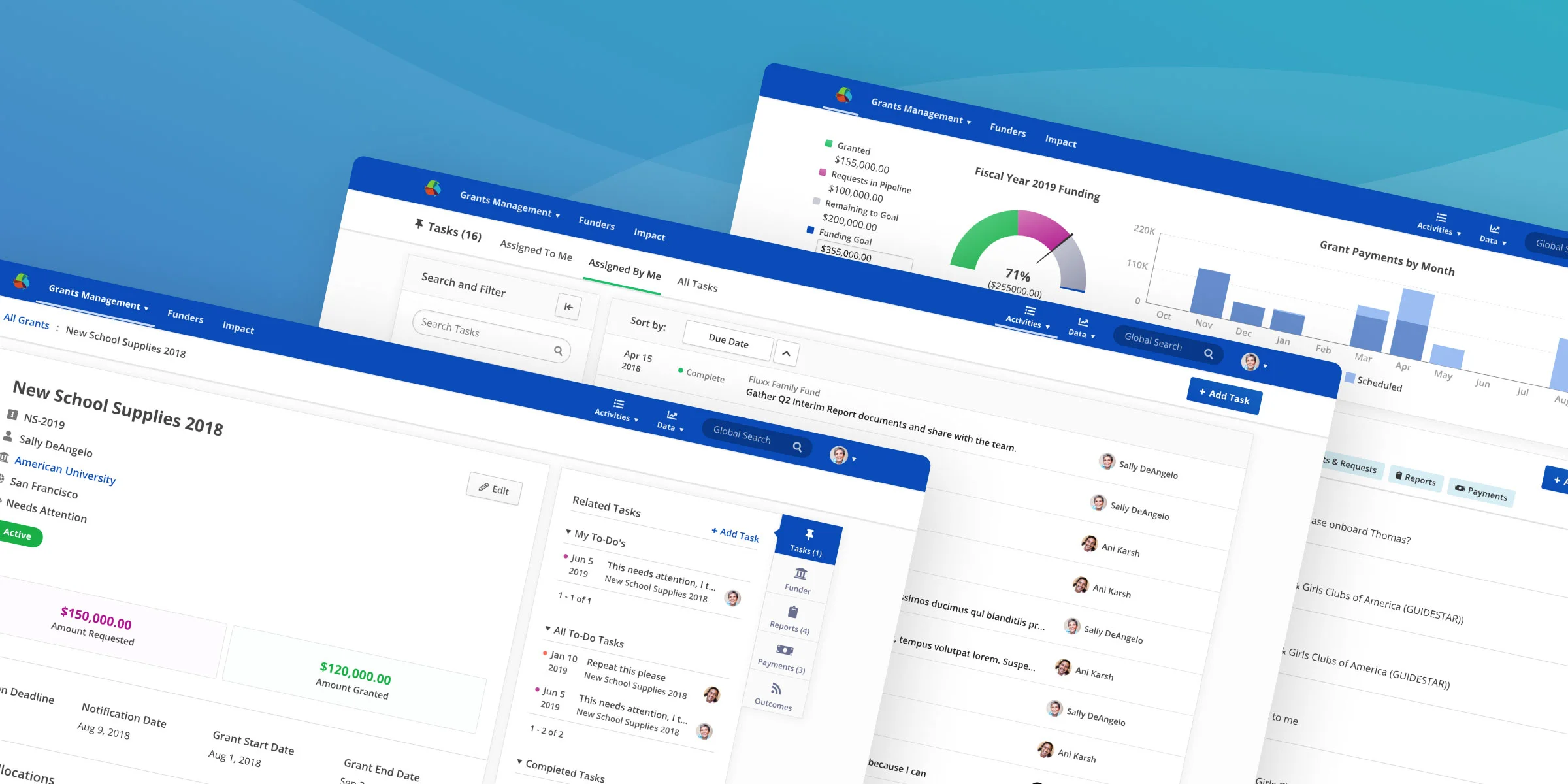
Nonprofits receive over $150 billion contributions a year through charitable grants. I mentored two full-time designers while we built an experience to manage those grants (I have only included contributions I am solely responsible for).
Where’s my stuff?
Fluxx’s foundation product, Grantmaker, was built around a data model hierarchy (Grants composed of multiple Payments and Reports), and this hierarchy was used for the initial approach to Grantseeker’s information architecture.
However, contextual inquiry and data from tools like HotJar and FullStory showed that nonprofit grantseekers indexed much more heavily on due dates, and rarely even attempted to consider everything for one grant at once (which makes sense when you consider that most 501(c)(3) grant timelines typically stipulate quarterly or semiannual payments and reports).

Original Grantseeker UI utilizing multi-column layout and the Fluxx data model as its UI hierarchy
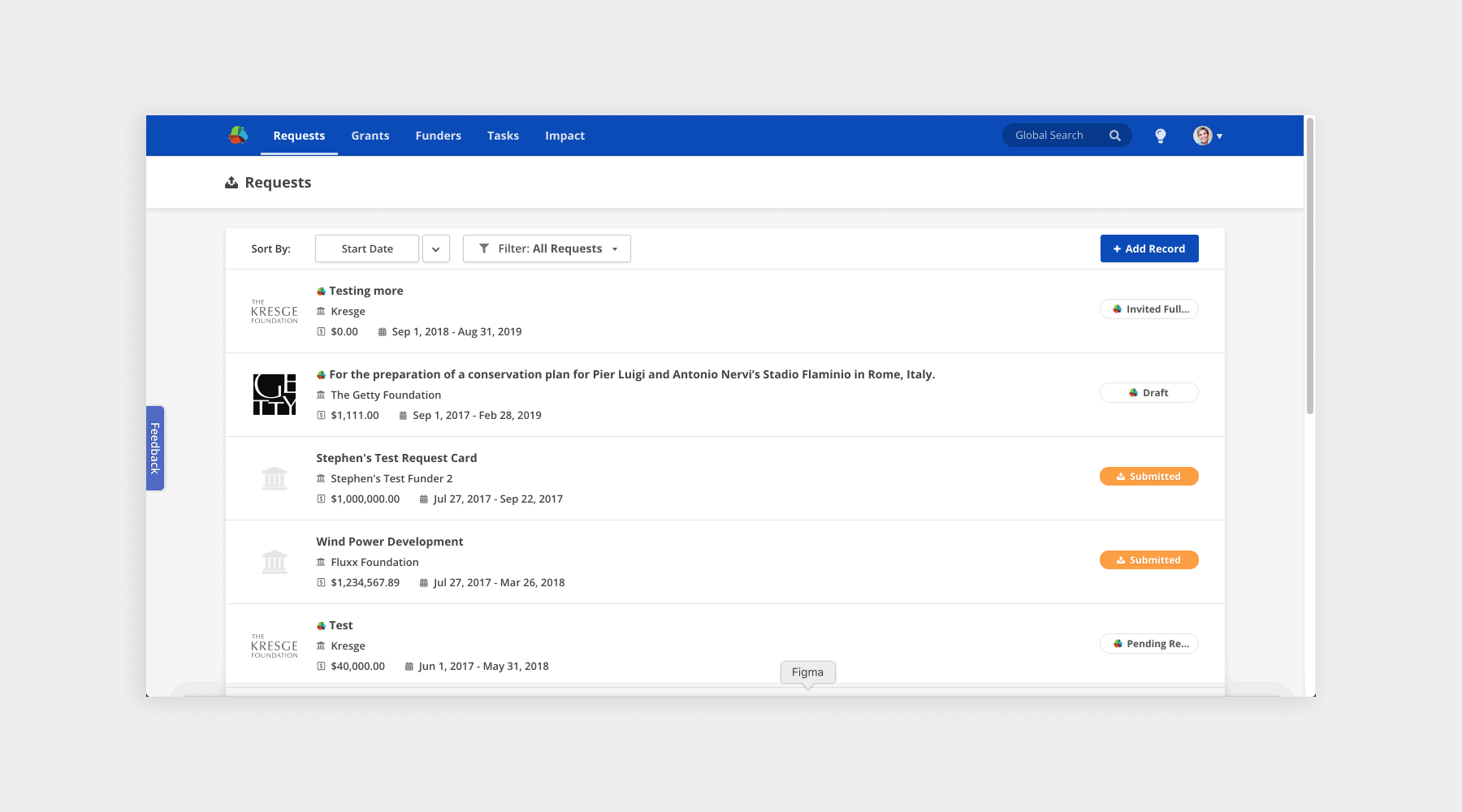
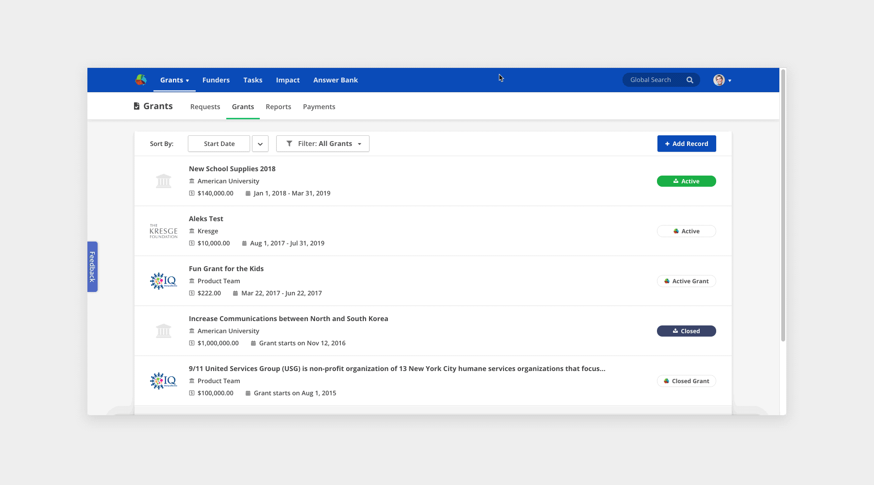
It’s common for grants managers to search and filter for specific metadata attributes, not necessarily the grant titles themselves. But Grantseekers were frustrated while trying to locate the things they knew were in the system, which reflected two problems:
List cards didn’t convey the data users were looking for effectively
Users couldn’t discover or understand filtering options
Iterating both in design tools and directly in the React codebase allowed me to rapidly test a variety of directions. I used design clickthroughs to validate hypotheses for changes that could require nontrivial infrastructure effort, and put together sandbox branches to run usability tests live or via screen share for others.
Secondary level tabs hiding information behind another click
Exploration that removed the friction of waiting for an intermediary page to load to access Reports or Payments
Getting Research Grounded
The sandboxes above made for a good start, but opened more questions than they answered. More than 1/3 of a cohort of usability test participants (including internal employees) could not tell me how to search or filter their list of grants.
As I ran through iteration cycles of rapid tests, I realized our existing Beta participant list and unsolicited emails weren’t painting a complete enough picture of customer needs, especially as the size and sophistication of organizations experimenting with Grantseeker began to increase.
My PM helped me pull a diverse list of 250 organization contacts, and I coded and sent them an outreach email resulting in 80+ voluntary research participants, the majority of whom participated regularly in both new feature validation and post-launch feature feedback.

In-person research (spontaneous and prompted)

Quantitative survey results
Broad Iteration
A minimal effort solution like moving the filters to the top of the list was sufficient to address the filter discoverability problem with our newly focused list pages, but didn’t solve our issue of it actually being “annoying to apply filters.”
I got approval for a one-week deep dive on design and prototyping scoped only to re-presentation of existing functtionality, and took the opportunity to step back and re-examine our filtering mechanisms in line with the page layout patterns for every type of data in the system.
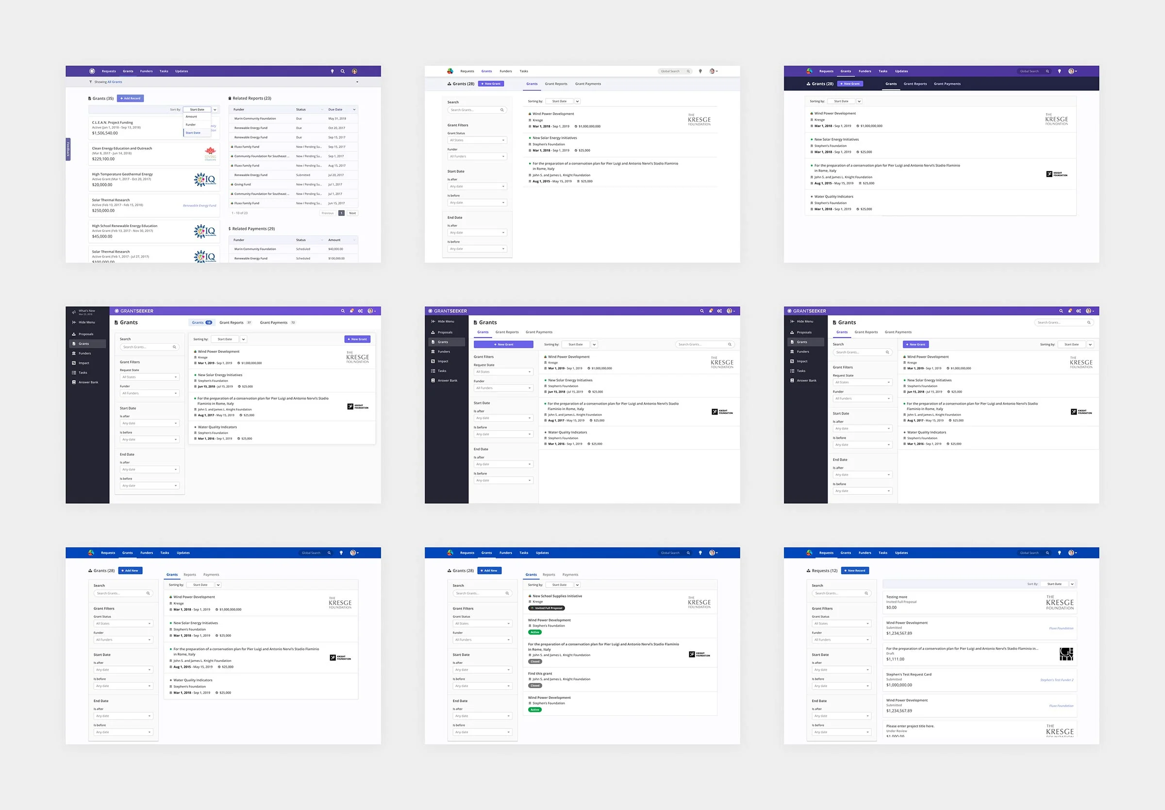
A few of the mockups used as discussion aids for list views, filters, and tabs
The same behaviors, differentiated by design
Filters allowed opportunities for visual and micro-interaction refinement. Though the actual filtering capabilities remained consistent, most of how they were used did change.
One great example of global form design patterns needing to be adapted to our specific needs was in the pre-filling of default filters. Nonprofits almost exclusively work on to-do aspects of Grants and Requests: Payments due and Reports to complete.
Stacking these filters allowed us to serve default views like All Reports that need completion (referred to as “Due”) or All tasks assigned to me, which were overwhelmingly the views people were clicking into anyways.

The filtering UI also includes some delighter polish elements that help build trust with our users by positioning Fluxx as a well-refined experience. The “Apply Filters” and “Reset All” buttons visually react to the state of the filter, indicating if there are changes outstanding.
Using CSS media queries and sticky positioning, the responsive filter panel sticks itself to the viewport if there is enough space on the screen, or gracefully degrades into a static element if being viewed through a smaller window.
Was it worth the effort?
In the NPS survey released after the updates to lists, 42% of all responses, including those coming from strong detractors, explicitly named design or ease of use in “what they liked about Grantseeker.”
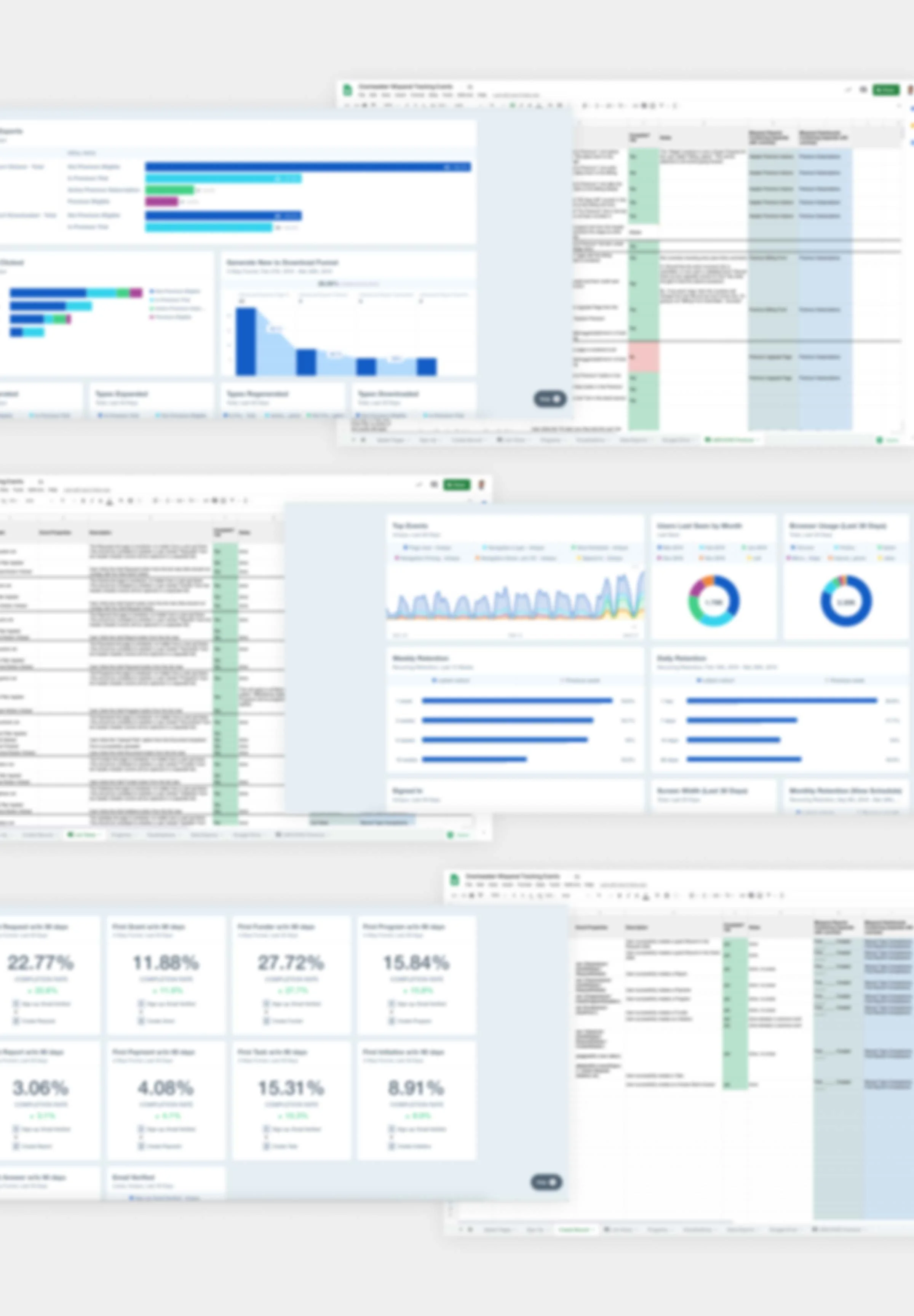
I continued to push for a data-informed approach at Fluxx, and personally got a GDPR-ready Data Processing Agreement signed by company leadership so we could install Mixpanel.
Some examples of questions being answered with Mixpanel were:
What kind of filters are being applied, and in which combinations?
Are people using filters heavily, or relying more heavily on keyword searches?
Is there a correlation between the scope of an organization’s grantseeking operation and their usage of filters? (this one had a very expected answer)
I was responsible for strategizing and documenting why tracking certain metrics would be valuable for a given business need, working with engineers to make sure those events were implemented appropriately, and organizing them in a dashboards for laymen to consume. Over time, I identified top line metrics for each of our core features, and added metric tracking considerations as a required alignment point for the design approval process.
Blurred to obfuscate strategic details
Managing grants at scale
The Timeline and Answer Bank both arose from the need for nonprofits to work more efficiently across many independent applications and grants, though in very different capacities. With the Timeline, nonprofits are able to identify how much time they have between action dates on Grants, as well as prepare for any situations where they may have deadline conflicts.
In order to apply for all these grants that nonprofits track, they are required to submit lengthy, often very boilerplate applications. The Answer Bank allows applicants to store, share, and re-use existing answers as-is or with modifications. Because this core job to be done could also be achieved through a Word or Google doc (copy paste a sentence), the value add for the Answer Bank comes through its reduction in friction in copying those answers and intelligently serving those Answers alongside other data when Grantseekers want to use them.
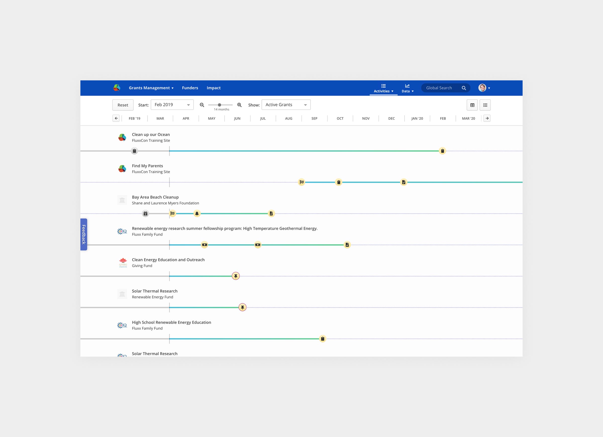
The Timeline allows users to view Grants in a Gantt chart-like layout to see where workload hotspots may arise

The Answer Bank biases towards consumption (re-use), as canned answers are copied far more often than they are updated.
Scannable Tasks as an Inbox vs Outbox
Though we could have sliced the data by assignee without breaking data into different tabs, collaborators actually think about tasks they’ve been assigned (I want to understand everything about what I’m being asked one at a time) differently from tasks they’ve assigned others (I want to see who owes me what, and who I need to bother first).
In nonprofits, the Grants Manager, typically the organizational champion, of our product, skew heavily as the delegators in Grantseeker. Task assignment from the enrolling email to other colleagues was always the strongest leading indicator of Grantseeker’s user retention, which informed the decision prioritize enhancements to Task management.

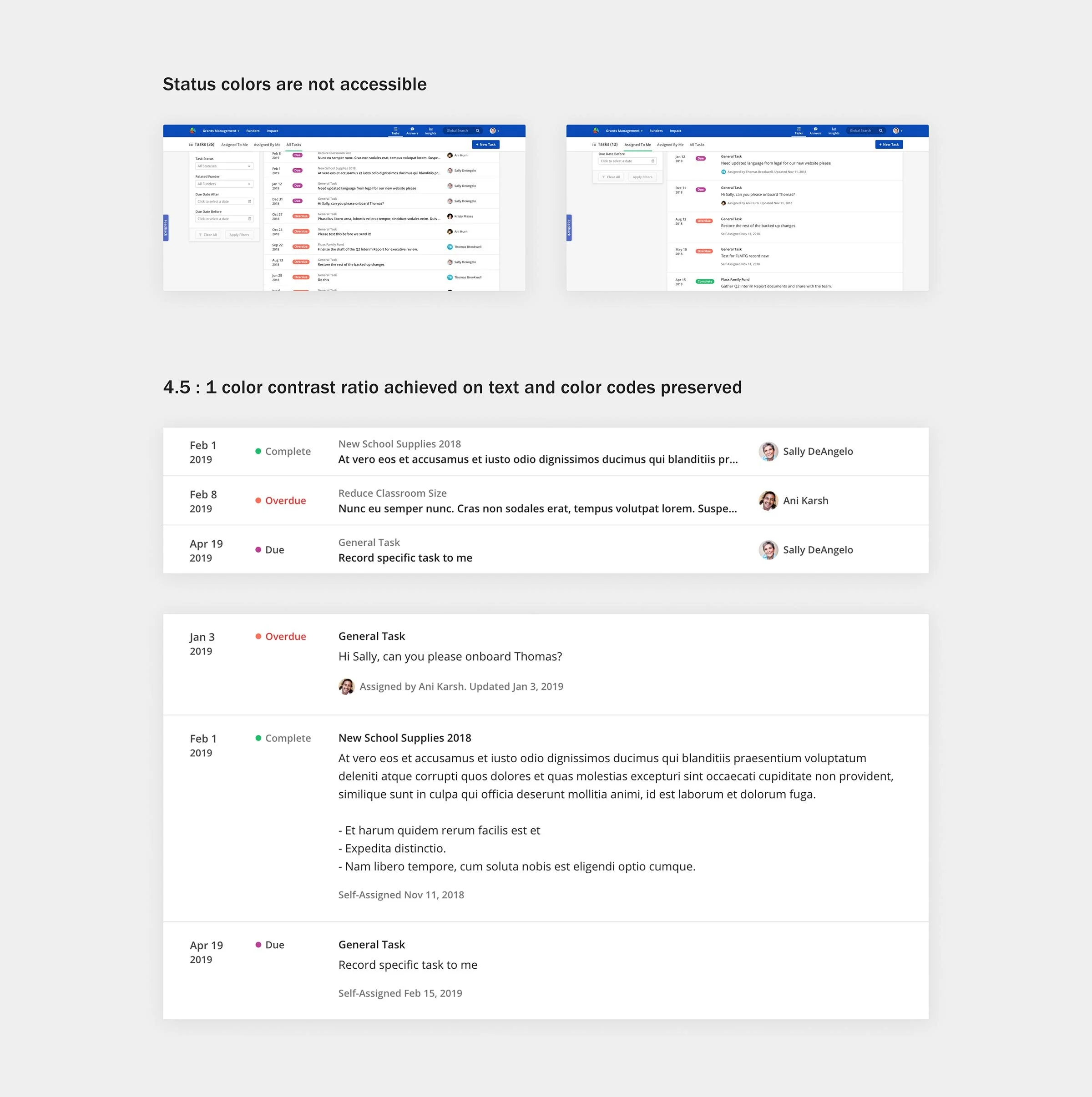
Inclusion and Accessibility
Being a vendor for government services and nonprofits also meant that accessibility was important. We ran and passed 3rd party certified ADA WCAG audits, which meant adjusting designs to avoid inaccessible patterns.
Enough list pages already, dude…
Our biggest competitors in the small to mid market grants management segments were spreadsheets: Microsoft Excel™ and Google Sheets™. To ensure Grantseeker would provide more value than a cloud-stored data dump, we needed to do more with the rich data that users were entering into Grantseeker.

Original Grant / Request Detail view did little to distinguish data, even known properties with static values
The existing sidebar modules were already breaking page layouts and grantseekers were annoyed by things moving around when data was added or removed.
The redesigned sidebar stays fixed to the top right of the screen so grantseekers can cross-reference the primary record with its related data, and even leverage that data to help them fill out Grants more efficiently by suggesting appropriate answers to common Grant application questions using machine learning.

Customers willing to budget for their budgets
Program budgets are core to how nonprofits operate and spend, and being able to understand what money went where is important or both regulatory compliance and organizational optimization.
As such, customers found the ability to visualize what portion of a given grant was allocated to which of their internal initiatives extremely valuable. After running a limited Beta with a slice of customers from single-person operations to small enterprises, the Programs feature quickly emerged as a selling factor that resulted in the ensuing development and rollout of Grantseeker’s $39.99/mo premium subscription model.

All together now
For a freemium product with absolutely no advertising budget over the year, seeing total active Grantseeker users more than double over the course of a year to over 5,000 organizations was exhilarating. The fact that design specifically distinguished our product to our users was just icing on the cake.
While my efforts on Grantseeker have been to elevate the level of design across the application overall, the Grantmaker case study zooms in much closer on the lifecycle of a contained project from product thinking through release. You can read about that here.